Introduction to matplotlib#
Note
This material is mostly adapted from the following resources:
Matplotlib is a comprehensive library for creating static and animated visualisations in Python.
Website: https://matplotlib.org/
GitHub: matplotlib/matplotlib
Note
Documentation for this package is available at https://matplotlib.org/stable/index.html.
Note
If you have not yet set up Python on your computer, you can execute this tutorial in your browser via Google Colab. Click on the rocket in the top right corner and launch “Colab”. If that doesn’t work download the .ipynb file and import it in Google Colab
Then, install numpy and matplotlib by executing the following command in a Jupyter cell at the top of the notebook.
We will use numpy to create some of the data that we will visualize with matplotlib.
!pip install matplotlib numpy
Importing a Package#
Besides numpy, we import the module pyplot from the matplotlib library and nicknames it as plt for brevity in the code.
import numpy as np
from matplotlib import pyplot as plt
Visualising Arrays with Matplotlib#
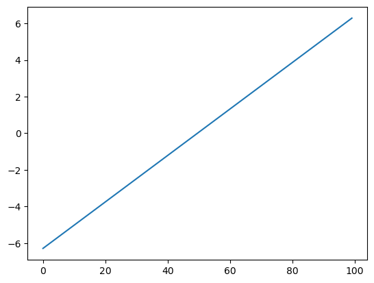
Let’s create an array to visualise it.
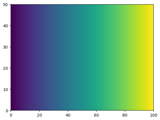
x = np.linspace(-2 * np.pi, 2 * np.pi, 100)
y = np.linspace(-np.pi, np.pi, 50)
xx, yy = np.meshgrid(x, y)
xx.shape, yy.shape
((50, 100), (50, 100))
For plotting a 1D array as a line, we use the plot command.
plt.plot(x);
There are many ways to visualise 2D data.
He we use pcolormesh.
plt.pcolormesh(xx);
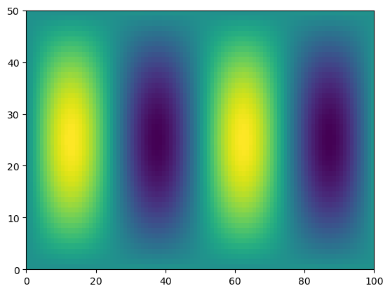
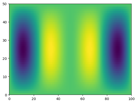
f = np.sin(xx) * np.cos(0.5 * yy)
plt.pcolormesh(f)
<matplotlib.collections.QuadMesh at 0x10d6a1950>
g = f * x
plt.pcolormesh(g)
<matplotlib.collections.QuadMesh at 0x10d701a90>
# apply on just one axis
g_ymean = g.mean(axis=0)
g_xmean = g.mean(axis=1)
plt.plot(x, g_ymean)
[<matplotlib.lines.Line2D at 0x10d771a90>]
plt.plot(g_xmean, y)
[<matplotlib.lines.Line2D at 0x10d7c7890>]
Figures and Axes#
The figure is the highest level of organisation of matplotlib objects.
fig = plt.figure()
<Figure size 640x480 with 0 Axes>
fig = plt.figure(figsize=(13, 5))
<Figure size 1300x500 with 0 Axes>
fig = plt.figure()
ax = fig.add_axes([0, 0, 1, 1])
Subplots#
Subplot syntax is a more convenient way to specify the creation of multiple axes.
fig, ax = plt.subplots()
ax
<Axes: >
fig, axes = plt.subplots(ncols=2, figsize=(8, 4), subplot_kw={"facecolor": "blue"})
axes
array([<Axes: >, <Axes: >], dtype=object)
Drawing into Axes#
All plots are drawn into axes.
# create some data to plot
import numpy as np

x = np.linspace(-np.pi, np.pi, 100)
y = np.cos(x)
z = np.sin(6 * x)
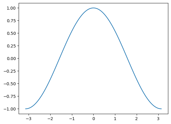
fig, ax = plt.subplots()
ax.plot(x, y)
[<matplotlib.lines.Line2D at 0x10d91c550>]
This does the same thing as
plt.plot(x, y)
[<matplotlib.lines.Line2D at 0x10d990190>]
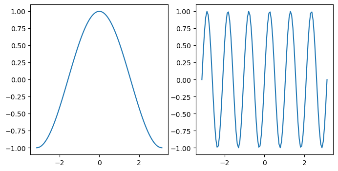
This starts to matter when we have multiple axes to manage.
fig, axes = plt.subplots(figsize=(8, 4), ncols=2)
ax0, ax1 = axes
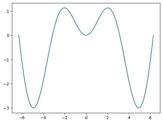
ax0.plot(x, y)
ax1.plot(x, z)
[<matplotlib.lines.Line2D at 0x10d80aad0>]
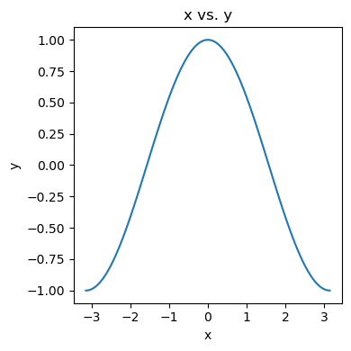
Labelling Plots#
Labelling plots is very important! We want to know what data is shown and what the units are. matplotlib offers some functions to label graphics.
fig, ax = plt.subplots(figsize=(4, 4))

ax.plot(x, y)
ax.set_xlabel("x")
ax.set_ylabel("y")
ax.set_title("x vs. y")

# squeeze everything in
plt.tight_layout()
Customising Plots#
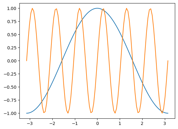
fig, ax = plt.subplots()
ax.plot(x, y, x, z)
[<matplotlib.lines.Line2D at 0x10daef4d0>,
 <matplotlib.lines.Line2D at 0x10daef610>]
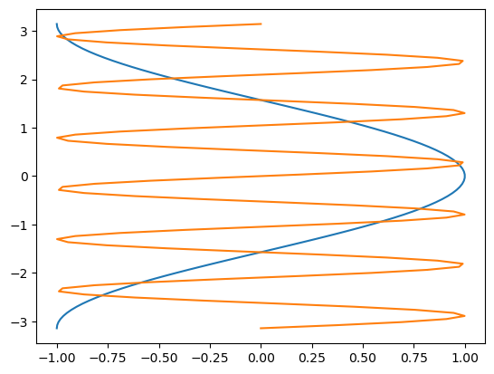
It’s simple to switch axes
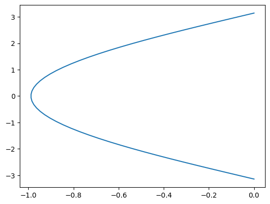
fig, ax = plt.subplots()
ax.plot(y, x, z, x)
[<matplotlib.lines.Line2D at 0x10db83250>,
 <matplotlib.lines.Line2D at 0x10db83390>]
Line Styles#
fig, ax = plt.subplots()
ax.plot(x, y, linestyle="--")
ax.plot(x, z, linestyle=":")
[<matplotlib.lines.Line2D at 0x10dc0b110>]
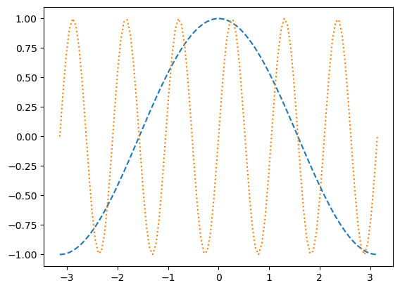
Colors#
As described in the colors documentation, there are some special codes for commonly used colors.
fig, ax = plt.subplots()
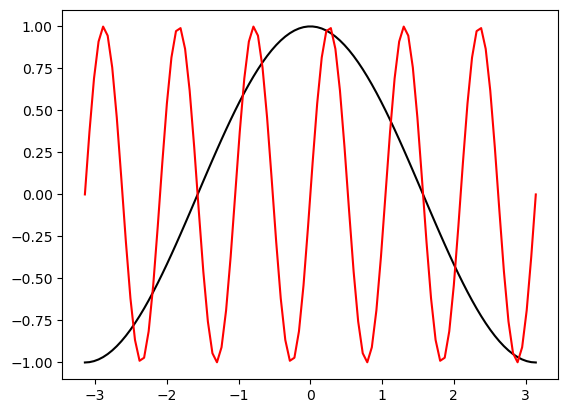
ax.plot(x, y, color="black")
ax.plot(x, z, color="red")
[<matplotlib.lines.Line2D at 0x10e84b250>]
Markers#
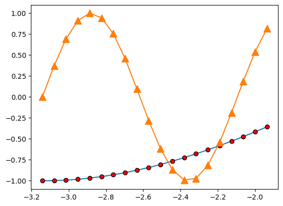
There are lots of different markers availabile in matplotlib!
fig, ax = plt.subplots()
ax.plot(x[:20], y[:20], marker="o", markerfacecolor="red", markeredgecolor="black")
ax.plot(x[:20], z[:20], marker="^", markersize=10)
[<matplotlib.lines.Line2D at 0x10e87f110>]
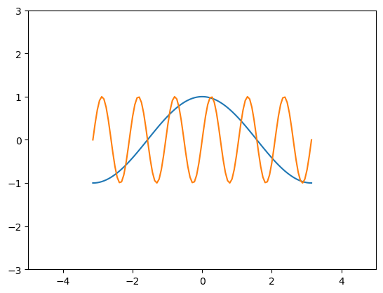
Axis Limits#
fig, ax = plt.subplots()
ax.plot(x, y, x, z)
ax.set_xlim(-5, 5)
ax.set_ylim(-3, 3)
(-3.0, 3.0)
Scatter Plots#
fig, ax = plt.subplots()

splot = ax.scatter(y, z, c=x, s=(100 * z**2 + 5), cmap="viridis")
fig.colorbar(splot)
<matplotlib.colorbar.Colorbar at 0x10d48f4d0>
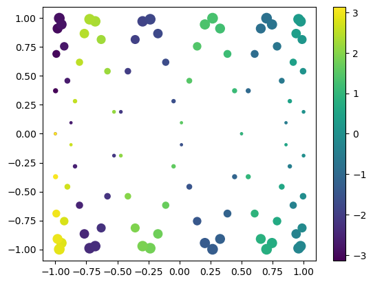
There are many different colormaps available in matplotlib: https://matplotlib.org/stable/tutorials/colors/colormaps.html
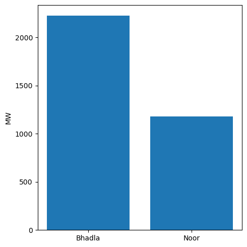
Bar Plots#
labels = ["Bhadla", "Noor"]
values = [2225, 1177]

fig, ax = plt.subplots(figsize=(5, 5))
ax.bar(labels, values)

ax.set_ylabel("MW")

plt.tight_layout()