Introduction to pypsa#
Note
This material is mostly adapted from the following resources:
PyPSA stands for Python for Power System Analysis.
PyPSA is an open source Python package for simulating and optimising modern energy systems that include features such as
conventional generators with unit commitment (ramp-up, ramp-down, start-up, shut-down),
time-varying wind and solar generation,
energy storage with efficiency losses and inflow/spillage for hydroelectricity
coupling to other energy sectors (electricity, transport, heat, industry),
conversion between energy carriers (e.g. electricity to hydrogen),
transmission networks (AC, DC, other fuels)
PyPSA can be used for a variety of problem types (e.g. electricity market modelling, long-term investment planning, transmission network expansion planning), and is designed to scale well with large networks and long time series.
Compared to building power system by hand in linopy, PyPSA does the following things for you:
manage data inputs
build optimisation problem
communicate with the solver
retrieve and process optimisation results
manage data outputs
Dependencies#
pandasfor storing data about network components and time seriesnumpyandscipyfor linear algebra and sparse matrix calculationsmatplotlibandcartopyfor plotting on a mapnetworkxfor network calculationslinopyfor handling optimisation problems
Note
Documentation for this package is available at https://pypsa.readthedocs.io.
Note
If you have not yet set up Python on your computer, you can execute this tutorial in your browser via Google Colab. Click on the rocket in the top right corner and launch “Colab”. If that doesn’t work download the .ipynb file and import it in Google Colab.
Then install the following packages by executing the following command in a Jupyter cell at the top of the notebook.
!pip install pypsa matplotlib cartopy highspy
Basic Structure#
Component |
Description |
|---|---|
Container for all components. |
|
Node where components attach. |
|
Energy carrier or technology (e.g. electricity, hydrogen, gas, coal, oil, biomass, on-/offshore wind, solar). Can track properties such as specific carbon dioxide emissions or nice names and colors for plots. |
|
Energy consumer (e.g. electricity demand). |
|
Generator (e.g. power plant, wind turbine, PV panel). |
|
Power distribution and transmission lines (overhead and cables). |
|
Links connect two buses with controllable energy flow, direction-control and losses. They can be used to model:
|
|
Storage with fixed nominal energy-to-power ratio. |
|
Storage with separately extendable energy capacity. |
|
Constraints affecting many components at once, such as emission limits. |
|
not used in this course |
|
Standard line types. |
|
2-winding transformer. |
|
Standard types of 2-winding transformer. |
|
Shunt. |
Note
Links in the table lead to documentation for each component.

Warning
Per unit values of voltage and impedance are used internally for network calculations. It is assumed internally that the base power is 1 MW.
From structured data to optimisation#
The design principle of PyPSA is that basically each component is associated with a set of variables and constraints that will be added to the optimisation model based on the input data stored for the components.
For an hourly electricity market simulation, PyPSA will solve an optimisation problem that looks like this
such that
Decision variables:
\(g_{i,s,t}\) is the generator dispatch at bus \(i\), technology \(s\), time step \(t\),
\(p_{\ell,t}\) is the power flow in line \(\ell\),
\(g_{i,r,t,\text{dis-/charge}}\) denotes the charge and discharge of storage unit \(r\) at bus \(i\) and time step \(t\),
\(e_{i,r,t}\) is the state of charge of storage \(r\) at bus \(i\) and time step \(t\).
Parameters:
\(o_{i,s}\) is the marginal generation cost of technology \(s\) at bus \(i\),
\(x_\ell\) is the reactance of transmission line \(\ell\),
\(K_{i\ell}\) is the incidence matrix,
\(C_{\ell c}\) is the cycle matrix,
\(G_{i,s}\) is the nominal capacity of the generator of technology \(s\) at bus \(i\),
\(P_{\ell}\) is the rating of the transmission line \(\ell\),
\(E_{i,r}\) is the energy capacity of storage \(r\) at bus \(i\),
\(\eta^{0/1/2}_{i,r,t}\) denote the standing (0), charging (1), and discharging (2) efficiencies.
Note
For a full reference to the optimisation problem description, see https://pypsa.readthedocs.io/en/latest/optimal_power_flow.html
Simple electricity market (economic dispatch) example#
Let’s assume we want to minimise the operational cost of an electricity system representing South Africa and Mozambique subject to generator limits and meeting the loads:
such that
We have the following data:
fuel costs in € / MWh\(_{th}\)
We are given the following information:
marginal costs in EUR/MWh
marginal_cost = dict(
    wind=0,
    coal=30,
    gas=60,
    oil=80,
)
power plant capacities in MW
power_plants = {
    "SA": {"coal": 35000, "wind": 3000, "gas": 8000, "oil": 2000},
    "MZ": {"hydro": 1200},
}
electrical load in MW
loads = {
    "SA": 42000,
    "MZ": 650,
}
Building a basic network#
By convention, PyPSA is imported without an alias:
import pypsa
Set parameter Username
Set parameter LicenseID to value 2767832
Academic license - for non-commercial use only - expires 2027-01-20
First, we create a new network object which serves as the overall container for all components.
n = pypsa.Network()
The second component we need are buses. Buses are the fundamental nodes of the network, to which all other components like loads, generators and transmission lines attach. They enforce energy conservation for all elements feeding in and out of it (i.e. Kirchhoff’s Current Law).
Components can be added to the network n using the n.add() function. It takes the component name as a first argument, the name of the component as a second argument and possibly further parameters as keyword arguments. Let’s use this function, to add buses for each country to our network:
n.add("Bus", "SA", y=-30.5, x=25, v_nom=400, carrier="AC")
n.add("Bus", "MZ", y=-18.5, x=35.5, v_nom=400, carrier="AC")
For each class of components, the data describing the components is stored in a pandas.DataFrame. For example, all static data for buses is stored in n.buses
n.buses
| v_nom | type | x | y | carrier | unit | location | v_mag_pu_set | v_mag_pu_min | v_mag_pu_max | control | generator | sub_network | |
|---|---|---|---|---|---|---|---|---|---|---|---|---|---|
| name | |||||||||||||
| SA | 400.0 | 25.0 | -30.5 | AC | 1.0 | 0.0 | inf | PQ | |||||
| MZ | 400.0 | 35.5 | -18.5 | AC | 1.0 | 0.0 | inf | PQ |
You see there are many more attributes than we specified while adding the buses; many of them are filled with default parameters which were added. You can look up the field description, defaults and status (required input, optional input, output) for buses here https://pypsa.readthedocs.io/en/latest/components.html#bus, and analogous for all other components.
The method n.add() also allows you to add multiple components at once. For instance, multiple carriers for the fuels with information on specific carbon dioxide emissions, a nice name, and colors for plotting. For this, the function takes the component name as the first argument and then a list of component names and then optional arguments for the parameters. Here, scalar values, lists, dictionary or pandas.Series are allowed. The latter two needs keys or indices with the component names.
n.add(
    "Carrier",
    ["coal", "gas", "oil", "hydro", "wind"],
    nice_name=["Coal", "Gas", "Oil", "Hydro", "Onshore Wind"],
    color=["grey", "indianred", "black", "aquamarine", "dodgerblue"],
)

n.add("Carrier", ["electricity", "AC"])
The n.add() function is very general. It lets you add any component to the network object n. For instance, in the next step we add generators for all the different power plants.
In Mozambique:
n.add(
    "Generator",
    "MZ hydro",
    bus="MZ",
    carrier="hydro",
    p_nom=1200,  # MW
    marginal_cost=0,  # default
)
In South Africa (in a loop):
for tech, p_nom in power_plants["SA"].items():
    n.add(
        "Generator",
        f"SA {tech}",
        bus="SA",
        carrier=tech,
        p_nom=p_nom,
        marginal_cost=marginal_cost.get(tech,0),#fuel_cost.get(tech, 0) / efficiency.get(tech, 1),
    )
As a result, the n.generators DataFrame looks like this:
n.generators
| bus | control | type | p_nom | p_nom_mod | p_nom_extendable | p_nom_min | p_nom_max | p_nom_set | p_min_pu | ... | min_up_time | min_down_time | up_time_before | down_time_before | ramp_limit_up | ramp_limit_down | ramp_limit_start_up | ramp_limit_shut_down | weight | p_nom_opt | |
|---|---|---|---|---|---|---|---|---|---|---|---|---|---|---|---|---|---|---|---|---|---|
| name | |||||||||||||||||||||
| MZ hydro | MZ | PQ | 1200.0 | 0.0 | False | 0.0 | inf | NaN | 0.0 | ... | 0 | 0 | 1 | 0 | NaN | NaN | 1.0 | 1.0 | 1.0 | 0.0 | |
| SA coal | SA | PQ | 35000.0 | 0.0 | False | 0.0 | inf | NaN | 0.0 | ... | 0 | 0 | 1 | 0 | NaN | NaN | 1.0 | 1.0 | 1.0 | 0.0 | |
| SA wind | SA | PQ | 3000.0 | 0.0 | False | 0.0 | inf | NaN | 0.0 | ... | 0 | 0 | 1 | 0 | NaN | NaN | 1.0 | 1.0 | 1.0 | 0.0 | |
| SA gas | SA | PQ | 8000.0 | 0.0 | False | 0.0 | inf | NaN | 0.0 | ... | 0 | 0 | 1 | 0 | NaN | NaN | 1.0 | 1.0 | 1.0 | 0.0 | |
| SA oil | SA | PQ | 2000.0 | 0.0 | False | 0.0 | inf | NaN | 0.0 | ... | 0 | 0 | 1 | 0 | NaN | NaN | 1.0 | 1.0 | 1.0 | 0.0 |
5 rows × 38 columns
Next, we’re going to add the electricity demand.
A positive value for p_set means consumption of power from the bus.
n.add(
    "Load",
    "SA electricity demand",
    bus="SA",
    p_set=loads["SA"],
    carrier="electricity",
)
n.add(
    "Load",
    "MZ electricity demand",
    bus="MZ",
    p_set=loads["MZ"],
    carrier="electricity",
)
n.loads
| bus | carrier | type | p_set | q_set | sign | active | |
|---|---|---|---|---|---|---|---|
| name | |||||||
| SA electricity demand | SA | electricity | 42000.0 | 0.0 | -1.0 | True | |
| MZ electricity demand | MZ | electricity | 650.0 | 0.0 | -1.0 | True |
Finally, we add the connection between Mozambique and South Africa with a 500 MW line:
n.add(
    "Line",
    "SA-MZ",
    bus0="SA",
    bus1="MZ",
    s_nom=500,
    x=1,
    r=1,
)
n.lines
| bus0 | bus1 | type | x | r | g | b | s_nom | s_nom_mod | s_nom_extendable | ... | v_ang_min | v_ang_max | sub_network | x_pu | r_pu | g_pu | b_pu | x_pu_eff | r_pu_eff | s_nom_opt | |
|---|---|---|---|---|---|---|---|---|---|---|---|---|---|---|---|---|---|---|---|---|---|
| name | |||||||||||||||||||||
| SA-MZ | SA | MZ | 1.0 | 1.0 | 0.0 | 0.0 | 500.0 | 0.0 | False | ... | -inf | inf | 0.0 | 0.0 | 0.0 | 0.0 | 0.0 | 0.0 | 0.0 |
1 rows × 32 columns
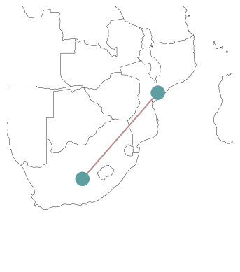
We can have a sneak peek at the network we built with the n.plot() function. More details on this in a bit.
n.plot(bus_sizes=1, margin=1);
Optimisation#
With all input data transferred into PyPSA’s data structure, we can now build and run the resulting optimisation problem. In PyPSA, building, solving and retrieving results from the optimisation model is contained in a single function call n.optimize(). This function optimises dispatch and investment decisions for least cost.
The n.optimize() function can take a variety of arguments. The most relevant for the moment is the choice of the solver. We already know some solvers from the introduction to linopy (e.g. “highs” and “gurobi”). They need to be installed on your computer, to use them here!
n.optimize(solver_name="highs")
Let’s have a look at the results.
Since the power flow and dispatch are generally time-varying quantities, these are stored in a different location than e.g. n.generators. They are stored in n.generators_t. Thus, to find out the dispatch of the generators, run
n.generators_t.p
| name | MZ hydro | SA coal | SA wind | SA gas | SA oil |
|---|---|---|---|---|---|
| snapshot | |||||
| now | 1150.0 | 35000.0 | 3000.0 | 3500.0 | -0.0 |
or if you prefer it in relation to the generators nominal capacity
n.generators_t.p / n.generators.p_nom
| name | MZ hydro | SA coal | SA wind | SA gas | SA oil |
|---|---|---|---|---|---|
| snapshot | |||||
| now | 0.958333 | 1.0 | 1.0 | 0.4375 | -0.0 |
You see that the time index has the value ‘now’. This is the default index when no time series data has been specified and the network only covers a single state (e.g. a particular hour).
Similarly you will find the power flow in transmission lines at
n.lines_t.p0
| name | SA-MZ |
|---|---|
| snapshot | |
| now | -500.0 |
n.lines_t.p1
| name | SA-MZ |
|---|---|
| snapshot | |
| now | 500.0 |
The p0 will tell you the flow from bus0 to bus1. p1 will tell you the flow from bus1 to bus0.
What about the shadow prices?
n.buses_t.marginal_price
| name | SA | MZ |
|---|---|---|
| snapshot | ||
| now | 60.0 | -0.0 |
Basic network plotting#
For plotting PyPSA network, we’re going use matplotlib and cartopy to plot the maps.
import matplotlib.pyplot as plt
import cartopy.crs as ccrs
PyPSA has a built-in plotting function based on matplotlib, ….
n.plot(margin=1, bus_sizes=2)
{'nodes': {'Bus': <matplotlib.collections.PatchCollection at 0x177c9f390>},
 'branches': {'Line': <matplotlib.collections.LineCollection at 0x177c9f4d0>},
 'flows': {}}
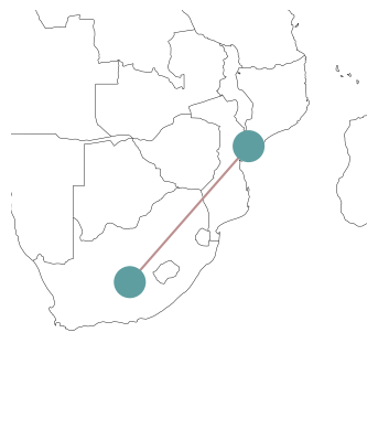
Since we have provided x and y coordinates for our buses, n.plot() will try to plot the network on a map by default. Of course, there’s an option to deactivate this behaviour:
n.plot(geomap=False);

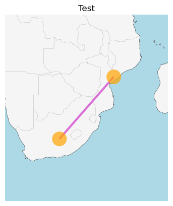
The n.plot() function has a variety of styling arguments to tweak the appearance of the buses, the lines and the map in the background:
n.plot(
    margin=1,
    bus_sizes=2,
    bus_colors="orange",
    bus_alpha=0.7,
    geomap_color=True,
    line_colors="orchid",
    line_widths=3,
    title="Test",
);
Just like with geopandas we can also control the projection of the network plot:
fig = plt.figure(figsize=(5, 5))
ax = plt.axes(projection=ccrs.EqualEarth())

n.plot(ax=ax, margin=1, bus_sizes=2);

We can use the bus_sizes argument of n.plot() to display the regional distribution of load. First, we calculate the total load per bus:
s = n.loads.groupby("bus").p_set.sum() / 1e4
s
bus
MZ    0.065
SA    4.200
Name: p_set, dtype: float64
The resulting pandas.Series we can pass to n.plot(bus_sizes=...):
n.plot(margin=1, bus_sizes=s);
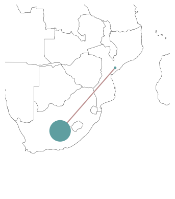
The important point here is, that s needs to have entries for all buses, i.e. its index needs to match n.buses.index.
The bus_sizes argument of n.plot() can be even more powerful. It can produce pie charts, e.g. for the mix of electricity generation at each bus.
The dispatch of each generator, we can find at:
n.generators_t.p.loc["now"]
name
MZ hydro     1150.0
SA coal     35000.0
SA wind      3000.0
SA gas       3500.0
SA oil         -0.0
Name: now, dtype: float64
If we group this by the bus and carrier…
s = n.generators_t.p.loc["now"].groupby([n.generators.bus, n.generators.carrier]).sum()
… we get a multi-indexed pandas.Series …
s
bus  carrier
MZ   hydro       1150.0
SA   coal       35000.0
     gas         3500.0
     oil            0.0
     wind        3000.0
Name: now, dtype: float64
… which we can pass to n.plot(bus_sizes=...):
n.plot(margin=1, bus_sizes=s / 3000);
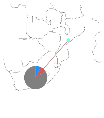
How does this magic work? The plotting function will look up the colors specified in n.carriers for each carrier and match it with the second index-level of s.
Modifying networks#
Modifying data of components in an existing PyPSA network is as easy as modifying the entries of a pandas.DataFrame. For instance, if we want to reduce the cross-border transmission capacity between South Africa and Mozambique, we’d run:
n.lines.loc["SA-MZ", "s_nom"] = 400
n.lines
| bus0 | bus1 | type | x | r | g | b | s_nom | s_nom_mod | s_nom_extendable | ... | v_ang_max | sub_network | x_pu | r_pu | g_pu | b_pu | x_pu_eff | r_pu_eff | s_nom_opt | v_nom | |
|---|---|---|---|---|---|---|---|---|---|---|---|---|---|---|---|---|---|---|---|---|---|
| name | |||||||||||||||||||||
| SA-MZ | SA | MZ | 1.0 | 1.0 | 0.0 | 0.0 | 400.0 | 0.0 | False | ... | inf | 0 | 0.000006 | 0.000006 | 0.0 | 0.0 | 0.000006 | 0.000006 | 500.0 | 400.0 |
1 rows × 33 columns
n.optimize(solver_name="highs")
You can see that the production of the hydro power plant was reduced and that of the gas power plant increased owing to the reduced transmission capacity.
n.generators_t.p
| name | MZ hydro | SA coal | SA wind | SA gas | SA oil |
|---|---|---|---|---|---|
| snapshot | |||||
| now | 1050.0 | 35000.0 | 3000.0 | 3600.0 | -0.0 |
Data import and export#
Note
Documentation: https://pypsa.readthedocs.io/en/latest/import_export.html.
You may find yourself in a need to store PyPSA networks for later use. Or, maybe you want to import the genius PyPSA example that someone else uploaded to the web to explore.
PyPSA can be stored as netCDF (.nc) file or as a folder of CSV files.
netCDFfiles have the advantage that they take up less space thanCSVfiles and are faster to load.CSVmight be easier to use withExcel.
n.export_to_csv_folder("tmp")
WARNING:pypsa.network.io:Directory tmp does not exist, creating it
INFO:pypsa.network.io:Exported network 'Unnamed Network' saved to 'tmp contains: generators, carriers, loads, lines, buses, sub_networks
n_csv = pypsa.Network("tmp")
INFO:pypsa.network.io:Imported network 'Unnamed Network' has buses, carriers, generators, lines, loads, sub_networks
n.export_to_netcdf("tmp.nc");
INFO:pypsa.network.io:Exported network 'Unnamed Network' saved to 'tmp.nc contains: generators, carriers, loads, lines, buses, sub_networks
n_nc = pypsa.Network("tmp.nc")
INFO:pypsa.network.io:Imported network 'Unnamed Network' has buses, carriers, generators, lines, loads, sub_networks
The following example is optional and not cover in the course “Integrated Energy Grids”#
Dispatch problem with German SciGRID network
SciGRID is a project that provides an open reference model of the European transmission network. The network comprises time series for loads and the availability of renewable generation at an hourly resolution for January 1, 2011 as well as approximate generation capacities in 2014. This dataset is a little out of date and only intended to demonstrate the capabilities of PyPSA.
n = pypsa.examples.scigrid_de()
INFO:pypsa.network.io:Retrieving network data from https://github.com/PyPSA/PyPSA/raw/v1.0.7/examples/networks/scigrid-de/scigrid-de.nc.
INFO:pypsa.network.io:Imported network 'SciGrid-DE' has buses, carriers, generators, lines, loads, storage_units, transformers
There are some infeasibilities without allowing extension. Moreover, to approximate so-called \(N-1\) security, we don’t allow any line to be loaded above 70% of their thermal rating. \(N-1\) security is a constraint that states that no single transmission line may be overloaded by the failure of another transmission line (e.g. through a tripped connection).
n.lines.s_max_pu = 0.7
n.lines.loc[["316", "527", "602"], "s_nom"] = 1715
Because this network includes time-varying data, now is the time to look at another attribute of n: n.snapshots. Snapshots is the PyPSA terminology for time steps. In most cases, they represent a particular hour. They can be a pandas.DatetimeIndex or any other list-like attributes.
n.snapshots
DatetimeIndex(['2011-01-01 00:00:00', '2011-01-01 01:00:00',
               '2011-01-01 02:00:00', '2011-01-01 03:00:00',
               '2011-01-01 04:00:00', '2011-01-01 05:00:00',
               '2011-01-01 06:00:00', '2011-01-01 07:00:00',
               '2011-01-01 08:00:00', '2011-01-01 09:00:00',
               '2011-01-01 10:00:00', '2011-01-01 11:00:00',
               '2011-01-01 12:00:00', '2011-01-01 13:00:00',
               '2011-01-01 14:00:00', '2011-01-01 15:00:00',
               '2011-01-01 16:00:00', '2011-01-01 17:00:00',
               '2011-01-01 18:00:00', '2011-01-01 19:00:00',
               '2011-01-01 20:00:00', '2011-01-01 21:00:00',
               '2011-01-01 22:00:00', '2011-01-01 23:00:00'],
              dtype='datetime64[ns]', name='snapshot', freq=None)
This index will match with any time-varying attributes of components:
n.loads_t.p_set.head(3)
| name | 1 | 3 | 4 | 6 | 7 | 8 | 9 | 11 | 14 | 16 | ... | 382_220kV | 384_220kV | 385_220kV | 391_220kV | 403_220kV | 404_220kV | 413_220kV | 421_220kV | 450_220kV | 458_220kV |
|---|---|---|---|---|---|---|---|---|---|---|---|---|---|---|---|---|---|---|---|---|---|
| snapshot | |||||||||||||||||||||
| 2011-01-01 00:00:00 | 231.716206 | 40.613618 | 66.790442 | 196.124424 | 147.804142 | 123.671946 | 83.637404 | 73.280624 | 175.260369 | 298.900165 | ... | 202.010114 | 222.695091 | 212.621816 | 77.570241 | 16.148970 | 0.092794 | 58.427056 | 67.013686 | 38.449243 | 66.752618 |
| 2011-01-01 01:00:00 | 221.822547 | 38.879526 | 63.938670 | 187.750439 | 141.493303 | 118.391487 | 80.066312 | 70.151738 | 167.777223 | 286.137932 | ... | 193.384825 | 213.186609 | 203.543436 | 74.258201 | 15.459452 | 0.088831 | 55.932378 | 64.152382 | 36.807564 | 63.902460 |
| 2011-01-01 02:00:00 | 213.127360 | 37.355494 | 61.432348 | 180.390839 | 135.946929 | 113.750678 | 76.927805 | 67.401871 | 161.200550 | 274.921657 | ... | 185.804364 | 204.829941 | 195.564769 | 71.347365 | 14.853460 | 0.085349 | 53.739893 | 61.637683 | 35.364750 | 61.397558 |
3 rows × 485 columns
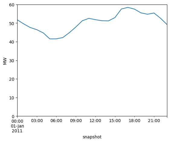
We can use simple pandas syntax, to create an overview of the load time series…
n.loads_t.p_set.sum(axis=1).div(1e3).plot(ylim=[0, 60], ylabel="MW")
<Axes: xlabel='snapshot', ylabel='MW'>
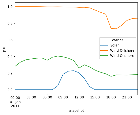
… and the capacity factor time series:
n.generators_t.p_max_pu.T.groupby(n.generators.carrier).mean().T.plot(ylabel="p.u.")
<Axes: xlabel='snapshot', ylabel='p.u.'>
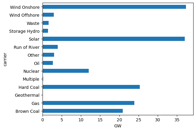
We can also inspect the total power plant capacities per technology…
n.generators.groupby("carrier").p_nom.sum().div(1e3).plot.barh()
plt.xlabel("GW")
Text(0.5, 0, 'GW')
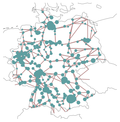
… and plot the regional distribution of loads…
load = n.loads_t.p_set.sum(axis=0).groupby(n.loads.bus).sum()
fig = plt.figure()
ax = plt.axes(projection=ccrs.EqualEarth())

n.plot(
    ax=ax,
    bus_sizes=load / 2e5,
);
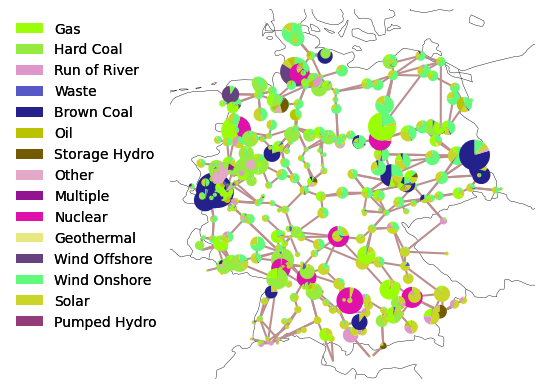
… and power plant capacities:
capacities = n.generators.groupby(["bus", "carrier"]).p_nom.sum()
For plotting we need to assign some colors to the technologies.
import random

carriers = list(n.generators.carrier.unique()) + list(n.storage_units.carrier.unique())
colors = ["#%06x" % random.randint(0, 0xFFFFFF) for _ in carriers]
n.add("Carrier", carriers, color=colors, overwrite=True)
Because we want to see which color represents which technology, we cann add a legend using the add_legend_patches function of PyPSA.
from pypsa.plot import add_legend_patches

fig = plt.figure()
ax = plt.axes(projection=ccrs.EqualEarth())

n.plot(
    ax=ax,
    bus_sizes=capacities / 2e4,
)

add_legend_patches(
    ax, colors, carriers, legend_kw=dict(frameon=False, bbox_to_anchor=(0, 1))
)
<matplotlib.legend.Legend at 0x31383a990>
This dataset also includes a few hydro storage units:
n.storage_units.head(3)
| bus | control | type | p_nom | p_nom_mod | p_nom_extendable | p_nom_min | p_nom_max | p_nom_set | p_min_pu | ... | state_of_charge_initial_per_period | state_of_charge_set | cyclic_state_of_charge | cyclic_state_of_charge_per_period | max_hours | efficiency_store | efficiency_dispatch | standing_loss | inflow | p_nom_opt | |
|---|---|---|---|---|---|---|---|---|---|---|---|---|---|---|---|---|---|---|---|---|---|
| name | |||||||||||||||||||||
| 100_220kV Pumped Hydro | 100_220kV | PQ | 144.5 | 0.0 | False | 0.0 | inf | NaN | -1.0 | ... | False | NaN | False | False | 6.0 | 0.95 | 0.95 | 0.0 | 0.0 | 0.0 | |
| 114 Pumped Hydro | 114 | PQ | 138.0 | 0.0 | False | 0.0 | inf | NaN | -1.0 | ... | False | NaN | False | False | 6.0 | 0.95 | 0.95 | 0.0 | 0.0 | 0.0 | |
| 121 Pumped Hydro | 121 | PQ | 238.0 | 0.0 | False | 0.0 | inf | NaN | -1.0 | ... | False | NaN | False | False | 6.0 | 0.95 | 0.95 | 0.0 | 0.0 | 0.0 |
3 rows × 36 columns
So let’s solve the electricity market simulation for January 1, 2011. It’ll take a short moment.
n.optimize(solver_name="highs")
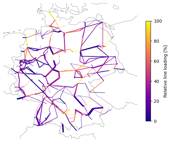
Now, we can also plot model outputs, like the calculated power flows on the network map.
line_loading = n.lines_t.p0.iloc[0].abs() / n.lines.s_nom / n.lines.s_max_pu * 100 # %
norm = plt.Normalize(vmin=0, vmax=100)
fig = plt.figure(figsize=(7, 7))
ax = plt.axes(projection=ccrs.EqualEarth())

n.plot(
    ax=ax,
    bus_sizes=0,
    line_colors=line_loading,
    line_cmap_norm=norm,
    line_cmap="plasma",
    line_widths=n.lines.s_nom / 1000,
)

plt.colorbar(
    plt.cm.ScalarMappable(cmap="plasma", norm=norm),
    ax=ax,
    label="Relative line loading [%]",
    shrink=0.6,
)
<matplotlib.colorbar.Colorbar at 0x176ab9a90>
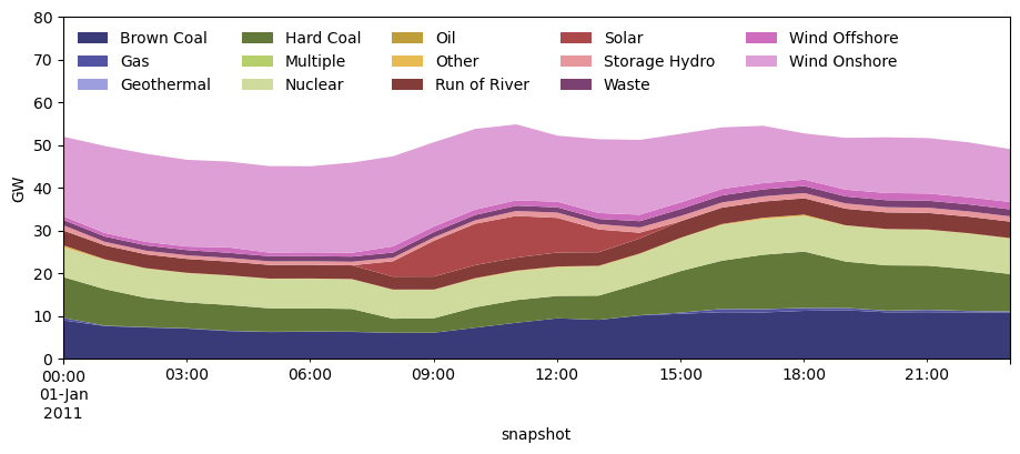
Or plot the hourly dispatch grouped by carrier:
p_by_carrier = n.generators_t.p.T.groupby(n.generators.carrier).sum().T.div(1e3)
fig, ax = plt.subplots(figsize=(11, 4))

p_by_carrier.plot(
    kind="area",
    ax=ax,
    linewidth=0,
    cmap="tab20b",
)

ax.legend(ncol=5, loc="upper left", frameon=False)

ax.set_ylabel("GW")

ax.set_ylim(0, 80);
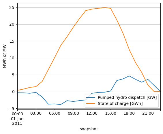
Or plot the aggregate dispatch of the pumped hydro storage units and the state of charge throughout the day:
fig, ax = plt.subplots()

p_storage = n.storage_units_t.p.sum(axis=1).div(1e3)
state_of_charge = n.storage_units_t.state_of_charge.sum(axis=1).div(1e3)

p_storage.plot(label="Pumped hydro dispatch [GW]", ax=ax)
state_of_charge.plot(label="State of charge [GWh]", ax=ax)

ax.grid()
ax.legend()
ax.set_ylabel("MWh or MW")
Text(0, 0.5, 'MWh or MW')
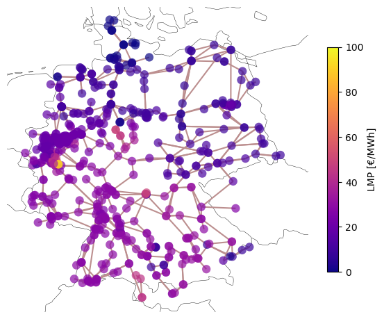
Or plot the locational marginal prices (LMPs):
fig = plt.figure(figsize=(7, 7))
ax = plt.axes(projection=ccrs.EqualEarth())

norm = plt.Normalize(vmin=0, vmax=100)  # €/MWh

n.plot(
    ax=ax,
    bus_colors=n.buses_t.marginal_price.mean(),
    bus_cmap="plasma",
    bus_cmap_norm=norm,
    bus_alpha=0.7,
)

plt.colorbar(
    plt.cm.ScalarMappable(cmap="plasma", norm=norm),
    ax=ax,
    label="LMP [€/MWh]",
    shrink=0.6,
)
<matplotlib.colorbar.Colorbar at 0x344038f50>